

Painting is one of the best options to refresh a home. With a few hundred dollars, you can change the whole feel of a room. This year we have seen paint colors turn towards a more dramatic feeling. Many are dark with a moody undertone. However pairing them with a brighter option could be the perfect option for your home.
According to the Spruce.com, Shadow by Benjamin Moore is the color of the year.

Adding a darker color like Shadow, can create drama in a space. It pairs well with classic neutrals.
Sherwin Williams’ Poised Taupe is the next featured color.
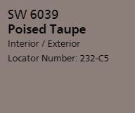
This taupe is a fresh take on a traditional neutral. It has a purple-ish hue to it so it adds a bit of something different.
Up next is Gilden’s Byzantine Blue.

This blue is a soothing color that can add a pop of color but is subtle enough that it goes with a lot other colors.
Olympic’s Cloudberry from the purple collection makes the list.

This violet shade is so versatile that it can look purple or blue depending on what other colors are featured in the room.
Dunn-Edwards is featured with Honey Glow.

With many blue and greys, there has to be a yellow on the list! This rich gold hue is the perfect choice to add as an accent.
To see more of the top colors for 2017, check out thespruce.com’s list. If you are thinking that you may want to sell your home in the next few years and want a professional opinion on paint choices, just let us know. We’d be happy to help!
